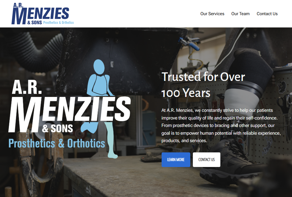
Website Logo Review
The text “Prosthetics & Orthotics” in the top logo can be difficult to read due to size and lack of contrast against the white background. To improve visibility, we can darken the text slightly, increase the font size, or both. This page shows 6 versions of the logo with those adjustments made.
Please view this page on a large screen (preferably a desktop) to ensure the images are displayed at full size. Small & medium devices, including the Surface Pro, often scale the display and you are not seeing the images at the proper resolution.
Option 6 is the option recommended by the designer.
Option 1: Original
Option 2: Darker Subtext Colour 1

Option 3: Darker Subtext Colour 2

Option 4: Larger Subtext, Original Colour

Option 5: Larger Subtext, Darker Colour 1

Option 6: Larger Subtext, Darker Colour 2
